"3D Artist" Sci-Fi Tips
Here are the 5 tips I contributeed to the article.
Leave Them Wanting More
In a lot of my work I try to create areas that imply the environment is
bigger than what is seen. This could be just showing the bottom of a
staircase or a slightly open door with light streaming through. This was
a low-poly piece I was asked to do with a very strong contrast in
lighting. I wanted to convey a sense of some comfort in the foreground
with the bright warm light and create a sense of unease in the
background with the red key light and cool ambient light. The sense of
unease is heightened by the fact that the source for the red light is
out of sight. Not knowing what is around the corner, but yet knowing
something is probably there, builds tension in the scene.
Reading Your Shapes
When putting a scene together it helps every now and then to zoom out or
squint at what you’re working on to make sure the shapes are readable.
Typically it’s best to give the viewer areas of visual rest and not have
detail cluttering every part of the scene. When you zoom out you should
be able to see the shapes fairly clearly. This concept applies to
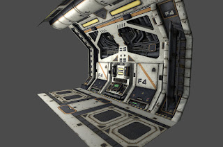
textures and well as geometry. This is an example of modular tile pieces
where I tried to create a good variation of sizes and level of detail
in my shapes and create a good balance between the colors and the shapes
they create.
Warm Colors Advance - Cool Colors Recede & Faking It
Also, in regards to lighting, warm colors advance and cool colors recede. In this image of an operating room, the blue light on the operating table would be the first thing the eye goes to because it’s the brightest, but immediately the eye is drawn towards the door where the warm light is. So, if you want to draw the eye towards something you might be better off using a warm light. An interesting note is that this principle is used a lot in interior design. If they want a room the feel larger they paint it with a cool color like blue or green. A room can feel more intimate and smaller by painting it a warm color like red or orange.
When lighting a scene, don’t be afraid to put lights in areas without a visible light source. Many would think that this is cheating, but in reality it works well in being able to enhance the composition by leading the eye to specific parts of the scene. Again, returning to the operating room scene, I lightmapped it externally and put inside Unity3d. If you look closely, the lighting doesn’t quite match up to the light sources, but for the sake of composition and where we wanted to lead the player this works well.
Find the Meaning
When making environments, one way to enhance them is to craft a story
around it. This is an image I made about a homeless man who lived
outside an exclusive community. The only one who was friendly to him was
a shopkeeper who gave him some food and allowed him to sleep in front
of his store. Even though there are no people in this scene the objects
tell the story. The environment itself is the character.
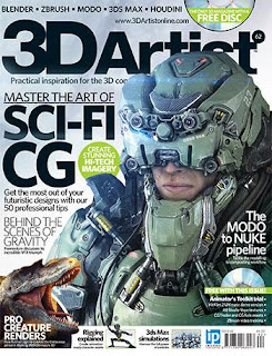
Issue 62 of "3D Artist"
Thanks for reading and feel free to leave a comment or send me an email at: jasongodbey07@gmail.com.
Thanks for reading and feel free to leave a comment or send me an email at: jasongodbey07@gmail.com.


